#COMMERCIAL ARCHITECTURE PROJECTS
emmanuelle moureaux presents home store in tokyo as a library of colors
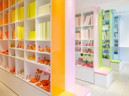
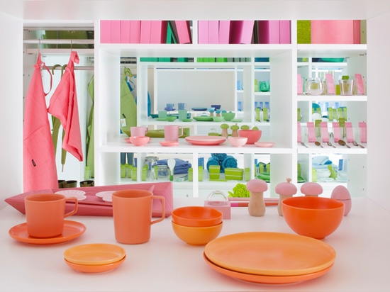
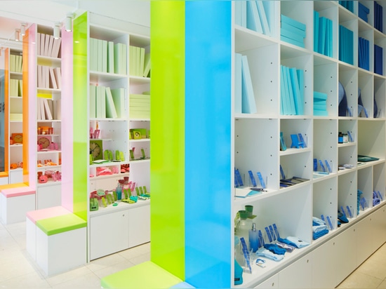
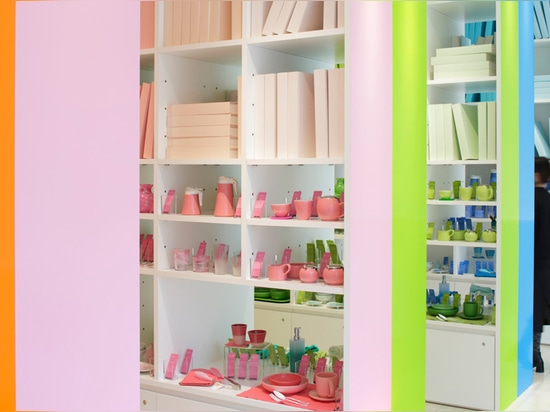
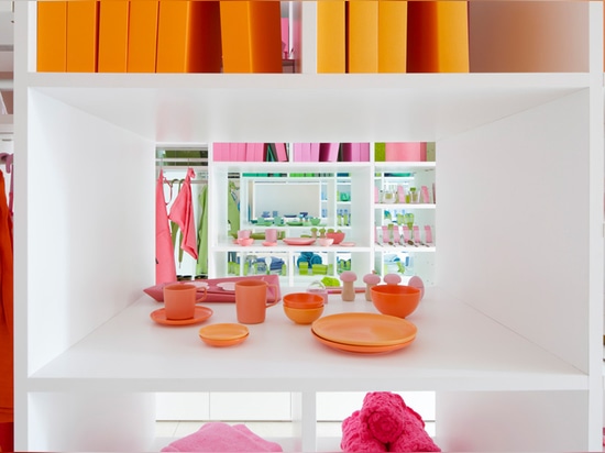
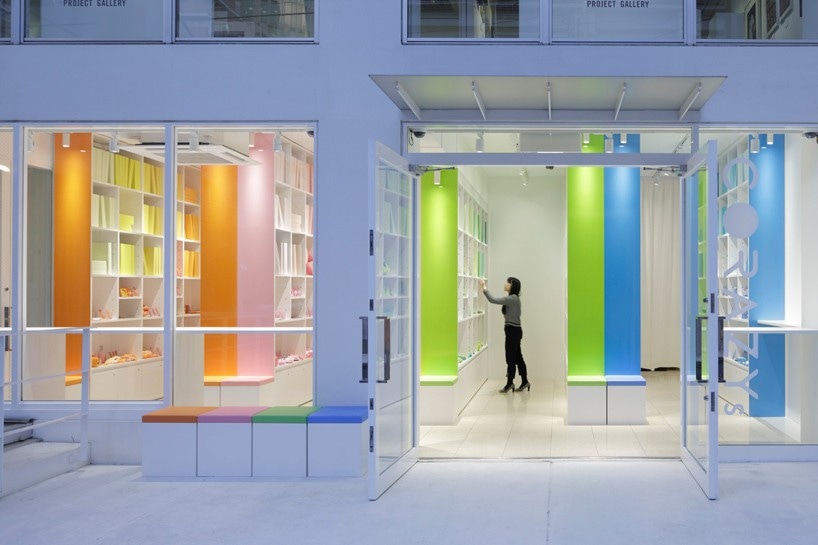
throughout the home interior store ‘corazys’ the apparent color scheme is orange, pink, green and blue.
designed by emmanuelle moureaux, the retail space in omotesando, tokyo follows the concept of a library and inside, floor to ceiling shelves are carefully lined with around 150 diverse items arranged in their specific color. for example, in the shelves of pink, the higher shelves are filled with books in lighter pastel shades and the lower shelves display items in more coral and darker tones.
presented like a library of colors, the space inside is white to serve as a neutral background, while large shelves are partitioned in the four bold shades. the interior store uses the concept of color to attract customers to their items and at the same time, it takes pride in selling products all manufactured in japan.
‘every library is filled with full of stories. corazys wishes to provide excitement in the day-to-day life, a sense of fulfillment, a sense of security, and to expand the sense of well-being… its aim is to create a store where one wants to meet with a favorite item, like encountering with a precious book in the library.’ – emmanuelle moureaux