#COMMERCIAL ARCHITECTURE PROJECTS
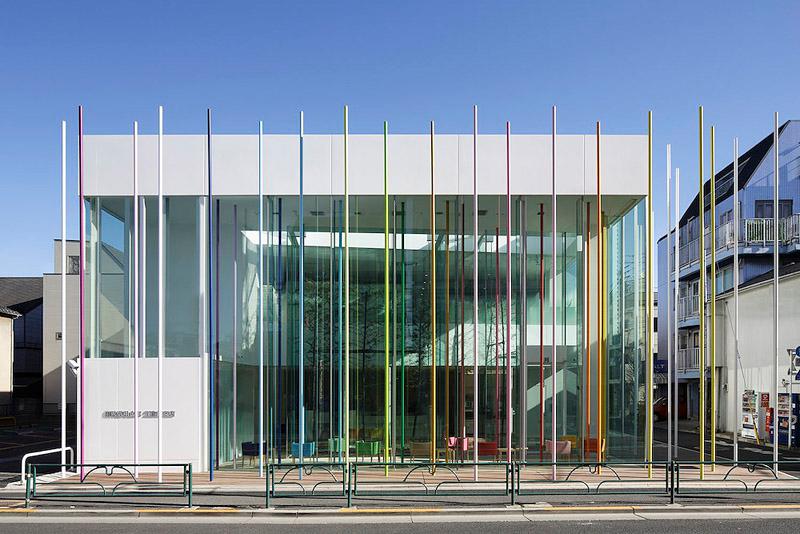
Sugamo Shinkin Bank / Ekoda branch
Sugamo Shinkin Bank is a credit union that strives to provide first-rate hospitality to its customers in accordance with its motto: “We take pleasure in serving happy customers”
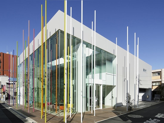
The unfortunate fact of the matter, however, is that most people feel more tension than joy when they walk into a bank. So when Tokyo-based French architect Emmanuelle Moureaux set about designing a branch office for Sugamo Shinkin in Ekoda, her primary goal was to create an environment so welcoming customers would want to linger there – if even for an extra minute or two. The colourful stainless-steel sticks that form the defining centrepiece of the project overlap in a space where colors blend into one another and the distinction between inside and outside becomes ambiguous. The scene changes continuously depending on where one is standing, resulting in a space that pulses with rhythm.
Moureaux’s firm designs everything from shops and offices to schools, beauty salons, and residences. This diverse body of work is united by the theme of color and architecture; for Moureaux, color is not a surface decoration but a tool for developing three-dimensional spaces. We asked her about the Sugamo Shinkin Bank project.
Please give us an overview of the project.
Ekoda is the fourth branch I have designed for Sugamo Shinkin Bank, and the third full building for them. In each of these projects my design has responded to the same essential request from the client: “a bank customers feel happy to visit."
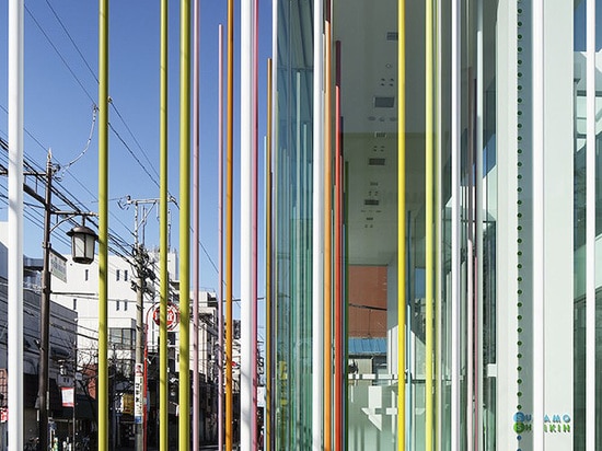
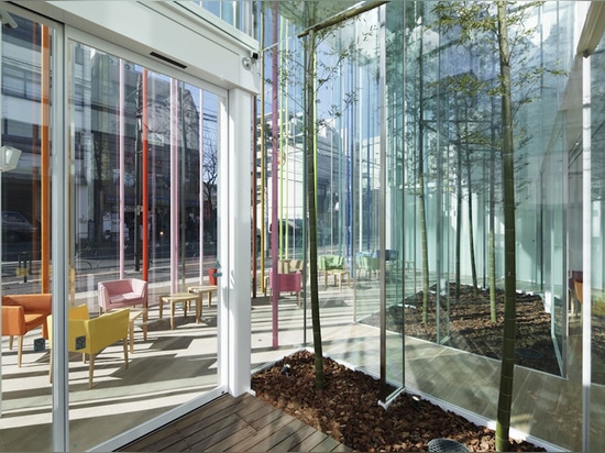
The site is located in a commercial district with many stores, facing onto a bustling, narrow sidewalk. I was inspired to express this sense of proximity between the building and its surrounding urban environment by merging the exterior and interior spaces. The main structure is set back approximately two meters from the property line, behind a timber-decked peripheral space filled with colorful nine-meter-tall sticks. These 29 exterior sticks are reflected on the transparent glazed façade and mix naturally with 19 interior sticks placed randomly inside the building. This rainbow shower restores color and playfulness to the town.
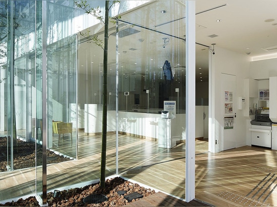
Entering the building, visitors notice they are still in an exterior courtyard leading to the bank's interior. Here also, the inside and outside are integrated. Walking past the glazed courtyard, visitors find themselves in a cafe-like open space filled with natural light. The bamboos in the courtyard extend skyward in concert with the colorful sticks. The exterior deck, interior open area, exterior courtyard, and interior teller counters compose four layers of space. The layers are reflected on the glazing, creating a sense of depth as they combine with complex shadows.
What was most important for you during the design process?
Breaking down the architectural boundary that’s conventionally formed by exterior walls, and instead using the colored sticks to create an ambiguous space where inside and outside blend; developing depth and rhythm through the overlaps and reflections of the sticks; evoking the sensation of being inside a shower of color. What challenges did you face in this project, and how did you respond to them?
Developing a method for manufacturing the thin, nine-meter tall sticks was a challenge, as was calculating the amount of deflection from earthquakes or strong winds.
What did you learn from this project? What will you take from it to future work?
This project nicely represents my approach to design, which I call “shikiri,” or “dividing space with colors.” I use colors as three-dimensional elements, like layers, in order to create spaces, not as a finishing touch applied to surfaces. For me color is the most important element in the creation of space. In this project the shape of the color was linear rather than planar. I’ve worked with forms composed from colored lines many times before, such as in my “toge” project [a modular product that can be assembled into room dividers or other shapes], but this was the first time for me to apply the concept at an architectural scale. In the future I’d like to continue exploring the potential of colored lines to form structures.
How does this project fit into current architectural trends such as social and environmental responsibility or technical developments?
In terms of architecture’s social role, I was aiming for a credit union that customers would want to spend even one second longer than usual in. The design shrinks the distance between the building and its urban surroundings, and functions as a resting place within the city. I was trying to break down the image of the bank as a hard, formal place full of tension.
What is the role of architecture and architects in society?
Evoking emotion.