#COMMERCIAL ARCHITECTURE PROJECTS
PHARMACY+
to cross a cross
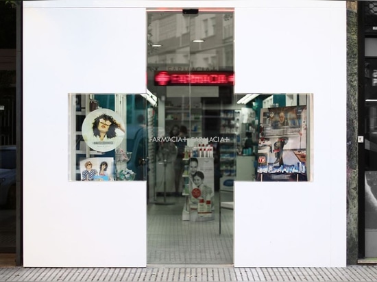
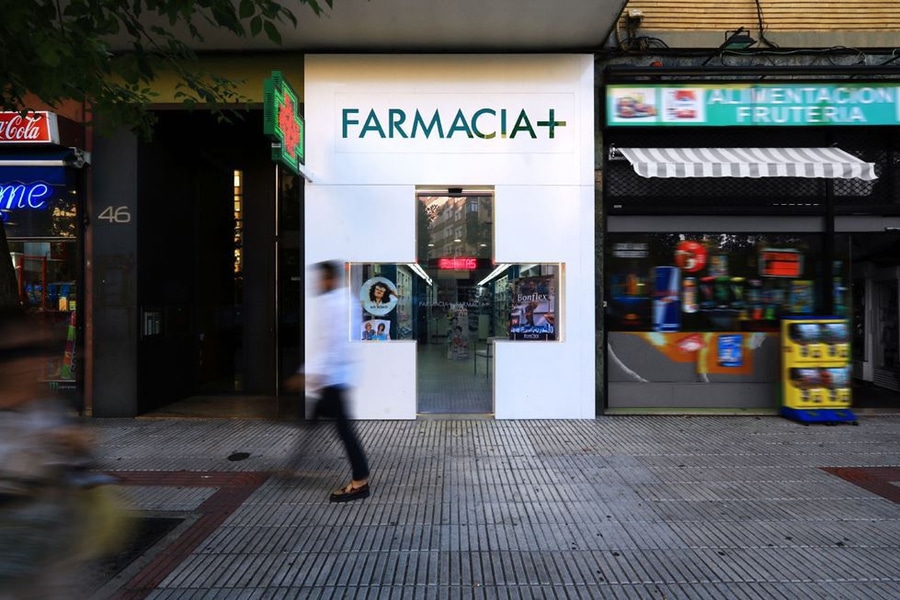
Farmacia+ is a project that wants to generate an icon-commercial image in the pre-existing pharmacy, which is located in Avenida Bayona 46 in Pamplona. We offer a new white plane in which it appears a large-trimmed cross. Every Pharmacy has a mark on its front. This is the icon of the guild. Its main function is to be identified from the distance. Bringing this icon to the architecture, we arrive at this result, where the facade explains in a forceful way the function of the place. The form cross is often used as a mark, and it allows to pinpoint a precise position. A clear geometric figure, whose two crossed lines enable to solve the access and showcases. The labelling and the banner complement this gesture. It all has allowed us to reach a solution that meets the costumer´s needs. We bet on an austere language for the facade. It was a behest from the environment. We think the new current scenario, a globalized and interconnected world, sometimes leads to a continuous flow of movement that produces noise. Maybe for an inexplicable fear to stop, to think and to observe, we have collaborated to create an aggressive environment of images, sound, messages of which we are no longer the owners. We need to protect ourselves, free ourselves from all that. It hinders our goals. Because of that we look for a new washed, well-known and identifiable image for the project, whose goal is to challenge the user in a natural way”. We work on the concept of plane, which defines a boundary between two spots, producing an experience to the user: "cross a cross." Through this gentle and practical architecture, we seek to generate an experience that fosters a memory in our mind.