#PUBLIC ARCHITECTURE PROJECTS
FEIT at Melbourne Connect by Hassell
Hassell’s new Faculty of Engineering and Information Technology within the University of Melbourne’s innovation precinct brings the faculty into the light and celebrates its profound and ongoing contribution.
Academics and post-graduate students are an interesting bunch to design for. Different disciplines have different predilections and needs. The interior of the Faculty of Engineering and Information Technology (FEIT) by Hassell is evidence of what happens when thoughtful designers respond with specific solutions for a client type that has seen constant evolution in recent years.
Along with many other Australian universities, the University of Melbourne continues to invest in good design and the work of skilled designers to improve its campuses. This expertise is needed now more than ever, particularly considering the transformational pressures forced on the tertiary sector by the COVID-19 pandemic. Arguably, this epochal event only accelerated and crystallized trends emerging for decades, but new problems require new solutions, and here we are in 2022.
The faculty was originally buried deep in the university’s Parkville campus: out of sight and perhaps out of mind to all but its own staff and alumni. FEIT occupied legacy buildings of varying type, age and flexibility. For all its virtues, one thing that the faculty could not boast was an excess of connectivity of any kind – internal or external.
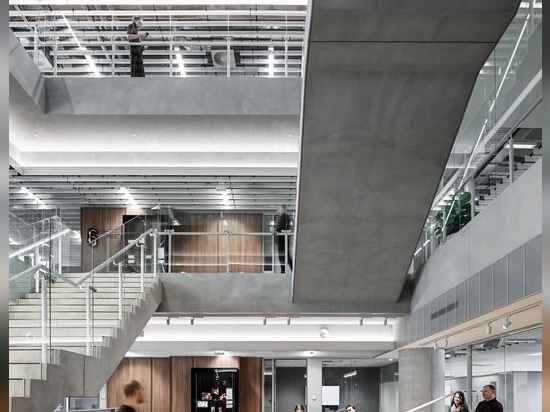
This deficit has been rectified by the new facility, along with the desire for more visibility for the academic practices and practitioners within. The interior spreads over 15,000 square metres and seven levels of a prominent building on the former site of the Royal Women’s Hospital in Carlton. It is both highly visible within the urban landscape and highly connected to the city, particularly through the skyline views available from the upper floors.
This is an interior organized around a vertical spine, split into two stacked three-level compartments, with a single contained floor below. It is clear from speaking to the designers that the voids, and their evidence of a desire for connectivity, theoretically could have continued through all seven levels. Unfortunately, the logistics of fire separation and smoke spread came into play: hence two vertically linked compartments.
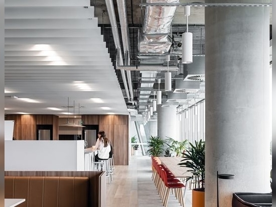
The purpose of the vertical spine is to contain, and connect, one half of the programmed space, which is divided neatly into two types. The two types are: active, collaborative and breakout-types of space (noisier, busier, more communal and social); and solo-oriented, more passive, and considerably quieter types of space, for focused academic production and thinking work. All the meeting, presentation, and seminar rooms are contained in the former part of the interior, accessed within the vertical spine.
A pleasing feature of the “busy” part of the interior is the proliferation of museum-like display cases that are scattered throughout the spine. These contain the ephemera and hardware of many decades of the faculty’s activities, from old computer equipment to replica satellites, and a host of other items that previously languished in locked cupboards. Again, this idea is about giving visibility to the faculty and students, through exposing the fruits of their activities.
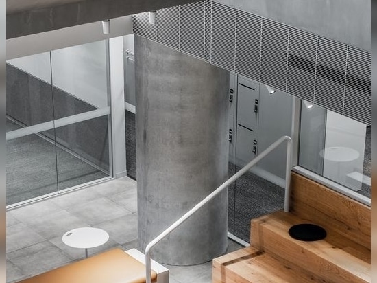
Acoustics have played an enormous role in the resolution of the design. The quieter academic workspaces, essentially both open-plan and individual offices in varying combinations, are all shunted off to the side of each floor plate, adjacent to the communal spine. Acoustic walls (both glazed and solid) separate the quiet areas from the noisy. The movement of staff and students between the two types of space becomes a visual “pulse,” a heartbeat, evidence of the human flow between the constituent parts of the interior as it goes about the business of being a vibrant academic space.
What does a contemporary university interior look like? What should it look like? Much commentary has been made about the “corporatization” of the tertiary sector, perhaps not without reason. But this interior does not mistake itself for a corporate space or workplace. The choice of colours, materials and surfaces is clean but not pristine, never too polished. The overall impression is neither corporate nor overly commercial, and this is a good thing. This kind of feels like a university space, even if the component parts read like a list of commercial office elements: open-plan offices, workstations, breakout spaces, lounge areas, meeting rooms, cafe hubs and the like.
This interior is an emphatic stab in a particular direction, one that is perhaps not yet definitive. I think that is fine. Good academic spaces and interiors in 2022 feel more like they are still “becoming” something, still evolving, and finding their language and flow, rather than having arrived at a settled point. There is a certain humility in this, and the results at 700 Swanston Street seem to suit the academic practitioners of the engineering arts and sciences very well.