#Public buildings, Hospitality
UoM Merchandise Store by Sibling Architecture
Designed by Sibling Architecture, the University of Melbourne’s new Merchandise Store blends bold design with heritage charm, transforming a compact space into a vibrant, flexible retail hub at the heart of the evolving Parkville campus.
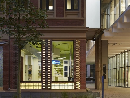
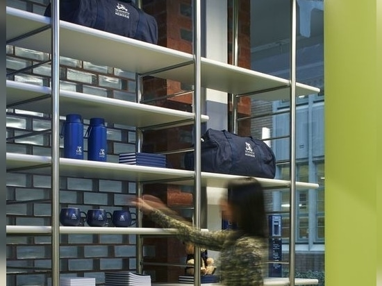
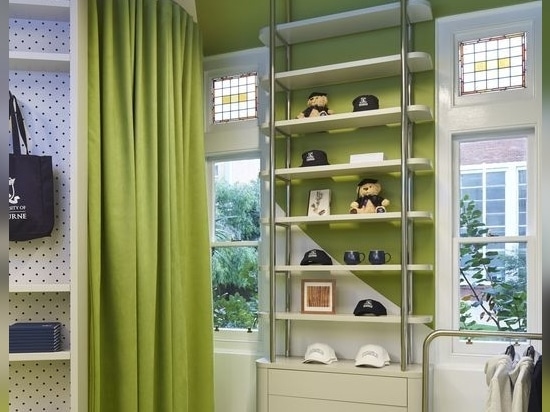
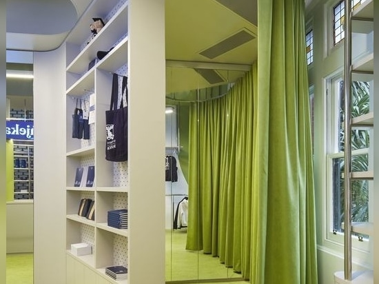
The University of Melbourne’s official merchandise store is a little lion of a fitout that roars quite loudly despite its small footprint. The shop occupies the northern end of a wing of a nineteenth-century heritage building, and the designers have played with a series of contrasting elements in the base building ranging from historic leadlight windows, newly installed steel columns and rather glamorous solid glass bricks embedded in the façade.
A lot is packed into a diminutive and very active space, and the shop oscillates between a more sparse, curated presentation of products and a contrasting “all hands on deck” excess of merchandise in the busy times. The fitout by Sibling Architecture is capable of managing either condition with aplomb, and on the day I saw it the shop was definitely in “packed and busy” mode, flush with graduation teddy bears, branded reusable coffee cups and hoodies.
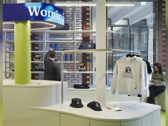
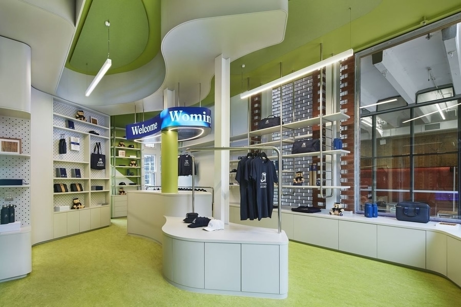
The colour palette of the interior is drawn from a recent corporate style refresh and after observing that most of the merchandise to be sold was finished in the university’s ubiquitous royal navy blue, the design team drew on the style guide and created a floor and ceiling in the contrasting lime green. The blue elements pop against the green, and product takes centrestage in the presentation of the space. A pale grey joinery scheme occupies the middle ground and ties the space together. The joinery provides a large amount of storage to supplement the display function, and a lot fits into a relatively small dimension.
The joinery, racks and lime-green-curtained change room have been conceived as a continuous ribbon of activity around the perimeter of the space, and a curving, fluid-formed and pod-like point-of-sale desk occupies the centre of the shop. The language of the forms of the point-of-sale and joinery draws on the imagery of water and fluidity, hinting at a broader design agenda at the university focused on concepts of water flow, native eels and a selection of other Indigenous and non-Indigenous motifs.
A dynamic digital sign proclaims a visual welcome in various languages above the point-of-sale desk. The digital sign wraps around the centre of the ceiling, and it can be programmed to display different messages and visuals at different times, in response to the programming of the space itself. It is possible to glimpse the bright and glowing interior of the store from Swanston Street, and the dynamic motion of the digital sign as seen through the windows of the shop draws attention to this destination retail moment on campus.
Taken together, the parts that make up this whole are a fitting counterpoint to the student services design works that have occurred nearby. The University of Melbourne Merchandise Store is a bit of colour, light relief, dynamic motion and fun in a historic setting.